Revised 13 March 2022
Accepted 14 October 2022
Available Online 21 November 2022
- DOI
- https://doi.org/10.55060/s.atssh.221107.047
- Keywords
- Heterogeneous isomorphism
Public welfare posters
Gestalt psychological aesthetics - Abstract
The practice works of this article all use the method of heterogeneous isomorphism to design public welfare posters. The content of the article first briefly describes the relationship between heterogeneous isomorphic techniques and Gestalt psychological aesthetics, then analyzes and summarizes the design requirements of public welfare posters, and summarizes the application points of heterogeneous isomorphic graphics in public welfare poster design combined with specific case analysis. Finally, according to the above needs and key points, this article carries out heterogeneous isomorphic public welfare poster design practice with three themes of protecting the environment, paying attention to marine life and food crisis.
- Copyright
- © 2022 The Authors. Published by Athena International Publishing B.V.
- Open Access
- This is an open access article distributed under the CC BY-NC 4.0 license (https://creativecommons.org/licenses/by-nc/4.0/).
1. INTRODUCTION
As a communication medium, public welfare posters can effectively disseminate and be captured by the audience depending on the theme, content, creative viewpoints and expression techniques of the poster design [1]. Isomorphism is the most commonly used strategy in the performance of public welfare posters. In the following, by analyzing the isomorphism methods used in some excellent cases, the authors summarize the key points that need to be paid attention to in the use of heterogeneous isomorphic methods in public welfare posters, which are to reflect simplicity, highlight interestingness and enhance emotionality. Combined with three requirements that the design of public welfare posters should highlight the theme, the point of view should conform to ethics, and the exaggeration and metaphors should be appropriate, the authors carried out design practices corresponding to three key points on the themes of protecting the environment, paying attention to marine life and food crisis, in order to achieve the publicity effect that the public welfare posters want to achieve.
2. HETEROGENEOUS ISOMORPHISM AND GESTALT PSYCHOLOGICAL AESTHETICS
Heterogeneous isomorphism, as an important part of Gestalt's psycho-aesthetic theory, firstly emphasizes “gestalt” [2]. Gestalt must be a whole, and there is an internal connection between all parts, forming an inseparable organic whole. The whole should be composed of various elements and components, but the gestalt cannot be decomposed into various components, and its characteristics and properties cannot be found from the original components. Heterogeneous isomorphism theory refers to the psychological change of the pursuit of the balance of power produced by the subject observing the object due to visual perception, that is, the heterogeneous isomorphism of a physical phenomenon and a psychological phenomenon. What it reveals is a dynamic change process of aesthetic experience from aesthetic object to aesthetic subject. In the same way, transforming it into a design technique and applying it to the graphic design language of the poster will also lead people to pursue the balance of forces in the picture, that is, when the graphics of different materials are combined into a new graphic, the human vision will stimulate the brain's imagination and association to pursue its balance, in order to actively explore the information to be conveyed by the poster. And one of the principles to be followed in this activity is “simplification”. The appearance presented by the simplified graphics gives people the best and most comfortable spiritual experience.
From above brief description of Gestalt psychological aesthetics of the heterogeneous isomorphism, it can be seen that the use of heterogeneous isomorphic expression techniques combined with concise, clear, relaxed and interesting design methods can help achieve the purpose of effectively conveying information in public welfare poster design.
3. DESIGN REQUIREMENTS AND CASE ANALYSIS OF PUBLIC WELFARE POSTERS
Public welfare posters convey a certain concept of public welfare in the form of posters. It does not have any profit purpose for the public. Its purpose is to promote the reflection, thinking and action of individuals and even the society on a certain issue by disseminating information. The design points to be followed in the design of public welfare posters mainly include the following three points.
3.1. Theme and Appeal Should Be Clear
A clear theme is the first level of creating a public welfare poster. Only when it is clear which category of the topic of ecology, society, morality, politics and security belongs to, can the designers continue to think about the next step. The message to be conveyed by the poster must be specific and definite, so the corresponding theme must also be clear [3]. However, it is necessary to accurately and specifically convey information within a limited screen, and in a short period of time, the audience can be interested in watching and can also arouse their thinking. This requires that the public welfare posters should not be less in the performance of the theme, which may make it difficult to explain the content to be expressed and feel incomplete. It can't be too much, and too much performance will make the point that the designers want to express the most not to be highlighted. Too little or too much is not desirable, and it means that there is no theme. Therefore, in the process of design, it is necessary to grasp a degree. It is necessary to express the theme in a small and precise manner, which can arouse people's thinking, and persuade and warn the audience.
3.2. Creative Viewpoints Should Be Correct and Ethical
On the basis of the clear and clear appeal of the first point, it is not enough to just stick to the theme, but also to restrict the creative viewpoints put forward on the theme, and not to aimlessly create ideas. Public welfare posters are advertisements without any profit purpose, and the objects they serve are the public and the society. The things that face the public and face the society must require that what they promote is active, positive and upward. And those passive, negative, and distorted values naturally cannot appear. Only things with positive energy can arouse the sunny side of people's hearts. Therefore, when conceiving the creative viewpoints of public welfare posters, the designers must conform to the requirements of social morality and ethics and the essence of traditional culture.
3.3. Appropriate Exaggeration and Clever Metaphors
While following the above two basic requirements, the designers must also grasp the “degree” of the means of expression. The following three techniques are commonly used in creative expression of public welfare posters, namely exaggeration, metaphor, and association. The main purpose of using it is to make the viewers generate memory points so that the information that the poster wants to convey can be accurately transmitted to the viewers. Excessive exaggeration, metaphors, and associations will cause psychological and physical discomfort to the viewer. Although it brings shock, it lacks some humanistic care. Appropriate exaggeration can effectively attract the public's visual attention and cause them to think and even act. A clever metaphor is to use a simple and easy-to-understand graphic language to describe complex truths or phenomena [4]. Association is the decoding and reconstruction of the result of human cognition of things, and association itself will trigger thinking and generate memory points when the viewer sees it for the first time. The most important thing for public welfare posters to achieve a good communication effect is to make the concept generate memory points through association.
4. APPLICATION OF HETEROGENEOUS ISOMORPHISM IN PUBLIC WELFARE POSTERS
The “heterogeneity” of heterogeneous isomorphism is the feeling of different textures produced by the objects in contact with people's sight based on life experience and judgment. For example: the waves are stirred up by the water hitting the shore, giving people a cool and feeling of weight, while the smoke is thin and soft, without weight. In order to create visual conflicts, objects of different textures can be partially connected, or other objects can be used to replace part of the original object organization structure, so that what people see conflicts with the previous unconscious judgment activities in their minds, and in order to balance this conflict, vision will cause the brain to actively think and reconcile this conflict, which can enhance the attractiveness of the changed graphics to the viewer.
4.1. Embodying Simplicity
The art of public welfare poster design is not like movies and dramas, which can have a complete plot to express the central idea. It can only express everything through an instant picture [5]. Concise graphic language, the meaning is relatively clear, the directivity is relatively single, and it is not easy to produce ambiguity. Heterogeneous isomorphic graphics are used in the design of public welfare posters, because the lack of parts of objects will make the expression of the works tactful, thus triggering people's effective thinking.
Fig. 1 shows a series of public welfare posters about promoting stopping wasting life. The vital organs of the human body give people a feeling of freshness and vitality because they are closest to the human body itself, while black plastic gives people the feeling of dullness and inferior quality. By isomorphizing the important organs of the human body such as the heart, liver, lungs and black plastic bags, it succinctly shows that wasting one's life is like throwing away important parts of life as garbage. Important things lose their original vitality and become meaningless.
The simpler the design of the public welfare poster, the more prominent the theme, and the more focused the points. Heterogeneous isomorphic figures express rich connotations in the most concise form, and this less-is-more is the expression of artistic maturity.
4.2. Highlighting the Interestingness
The purpose of public welfare poster design is not only to effectively disseminate information, but also to cater to the audience's preferences. If information conveyed by public welfare posters is regarded as a product, then the designers create what kind of visual experience the consumers like. If the designers want to make the design content of public welfare posters deeply rooted in the hearts of the people and make people willing to accept it, it is necessary look at it from the perspective of the audience, and seek an itching point that can really grab the viewer and mobilize the viewer's interest in “buying” the product through transpositional consideration. An effective way is to add interestingness to the graphics, in short, to make the graphics look interesting and fun [6].
Heterogeneous isomorphism method can choose typical convincing graphics as central visual elements, and use the similar phenomenon between graphics and graphics to carry out isomorphism. This form not only opens up a new way for the content performance of poster advertisements but also for enhancing the interest of works.
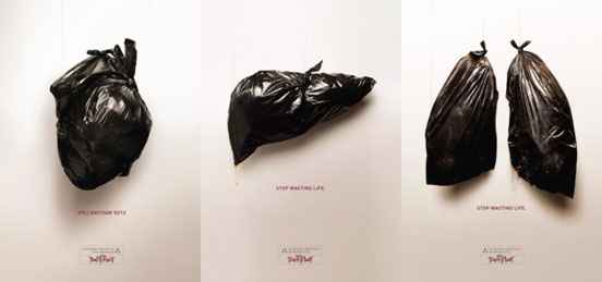
Series of public welfare posters of “Stop Wasting Your Life” (source: https://webecoist.momtastic.com).
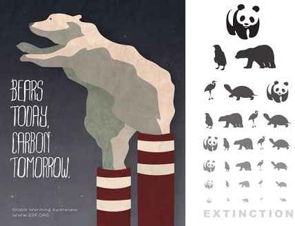
Protect the environment and protect wildlife (source: https://brightside.me).
As shown in Fig. 2 (left), the cute shape of the polar bear shows a gesture of calling for help, and the thick smoke that emerges represents the pollution caused by humans to the environment. By isomorphizing the shape of the polar bear and the white smoke from the chimney, people's associations are aroused, and this cute form is used to call on people to reduce the air-polluting gases emitted by human activity and jointly protect our homeland. While making people feel uncomfortable inside, it can also be expressed more gently. As shown in Fig. 2 (right), the naive animal image and the letters in the vision chart are heterogeneous isomorphism. The lower the eye chart is, the more unclear it is, and the animals gradually become smaller or even disappear with the eye chart. It is interesting and can also cause reflection, thus stimulating people's action to protect animals.
Heterogeneous isomorphic graphics are just right to add interest and eye-catching, so that viewers can unconsciously receive the information conveyed in the poster in a relaxed and pleasant mood, thereby transforming it into the power of action [7].
4.3. Enhancing Emotionality
The audiences of public welfare posters are people, and people need to be moved by feelings and reason. The feelings here refer to emotion. Human emotion usually induces people's actions, which coincides with the ultimate purpose of public welfare poster design. A poster is not only to convey information to the viewer, but more importantly, the designers hope that it can inspire thinking and ultimately inspire action through viewing. With emotional intervention in the poster, it is easier to move, infect and affect people.
Fig. 3 shows a group of public welfare posters for animal protection. Giraffes, crocodiles, and elephants in nature are selected, but they are not shown in their common forms, but cut off with similar shapes to tree stumps. The chopped tree stumps will remind people of sharp axes, and the limbs of some animals are reminiscent of the tragic conditions of animals after their homes have been destroyed. The designers conduct heterogeneous isomorphism of the two and make a cut at the end. The intention is to show that cutting down trees will destroy animal homes, which is equivalent to harming wild animals. Through this heart-wrenching picture, it touches the hearts of the viewers and calls on people to protect animal homes.
The theme of public welfare is oriented to human beings, so it will definitely be people-oriented, and the heterogeneous isomorphic graphics can touch people's hearts in a concise but not simple way, trigger deep emotions, evoke memories, generate associations, and emotionally resonate with people. It is definitely the most effective communication.

Series of public welfare posters of “Guarding Animal Homes” (source: https://www.commarts.com).
4.4. Application Practice
Through the analysis of the design requirements of public welfare posters and application case analysis of heterogeneous isomorphic graphics in public welfare posters, it can be clear that when designing public welfare posters, first of all, the theme and the appeal should be clear, secondly, the creative viewpoints should be correct, in line with morality and ethics, and finally there can be appropriate exaggeration and clever metaphors in design. The application of heterogeneous isomorphic graphics to the design of public welfare posters can reflect simplicity, highlight interestingness and enhance emotionality. Based on the guidance of the above methods, this public welfare poster design selected three themes for poster design, namely environmental protection, marine life protection and food crisis.
The design was initially brainstormed through the “petal” mind map, that is, the shape of the petals was simulated, and the keywords that matched the theme were listed first, and then the nouns with a greater degree of association were listed one by one and the listed nouns were screened, and words that are similar in shape and related to the theme for poster content creation were selected.
4.4.1. Design Process and Description of “Gift”
The first is the design of public welfare posters with the theme of protecting the environment. Human industrial activities emit waste gas, which causes environmental changes and brings about natural disasters caused by many environmental problems, such as earthquakes, tsunamis, and global warming. Through the noun screening of the mind map, it is found that the flue gas emitted by the chimney and the waves caused by the tsunami have no fixed shape. The similar parts of the two can be isomorphic, the waves caused by the tsunami give people the feeling of danger, and the smoke from the chimney can be reminiscent of the exhaust gas of the factory. The simple combination of the two can trigger people's thinking about the danger of natural disasters caused by exhaust gas, and two different styles have been tried. One is a flat style (Fig. 4) and the other is a hand-painted style with a crayon texture (Fig. 5). After comparing and thinking, the two styles were combined (as shown in Fig. 6), refined and details added to make the picture look more vivid and rich. Since the content expressed by the theme is a natural disaster – tsunami caused by human industrial activities – the poster is named a slightly ironic “Gift”. The overall tone of the picture adopts the inherent color of the object, and at the same time adopts the law of gradual beauty of form, that is, the white smoke gradually changes into the waves formed by the isomorphism of the smoke and white waves stirred by the waves, and the part of the waves and water is blue-green. The overall composition is vertical. The three groups of graphics are concise and the theme of the poster is placed in the lower left corner in the form of a seal, filling the blank part of the picture, which not only clarifies the theme, but also achieves a certain balance in the layout of the poster, making the visual effect of the picture more complete.

Sketch 1 of “Gift” (source: made by the authors).

Sketch 2 of “Gift” (source: made by the authors).
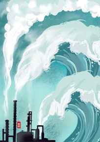
Completed picture of the poster “Gift” (source: made by the authors).
4.4.2. Design Process and Description of “QR ‘Hippocampus’”
“QR ‘Hippocampus’” is a public welfare poster about protection of marine life. The purpose of the creation is to hope that people can pay more attention to the current situation of marine life. Therefore, it is associated with the media that people use every day, such as traditional media like newspapers or new media such as mobile phones. Through association, “code” and “horse” have a homophonic relationship in pronunciation. The shape of the hippocampus can be reminiscent of marine creatures, and the appearance of the QR code will make people feel “scanning the code to pay attention”. The two are combined to a certain extent, and the theme can be expressed by scanning the code and paying attention (Fig. 7). At first, the QR code and hippocampus were completely isomorphic, and the recognition of the hippocampus was not high. In the subsequent production process, in order to increase the interestingness of the viewers, the designers decided to refine it, and only the body part of the hippocampus and the QR code are heterogeneous and isomorphic, and the scan frame is removed to create the feeling of lack to trigger people's active thinking (as shown in Fig. 8). And the sketch was refined in a more realistic way to enhance the sense of reality. In the process of perfecting the poster, the heterogeneous isomorphic figures are arranged through repeated formal beauty laws, and the English letters of the theme are placed on the top layer of the picture to enhance the formal sense of the poster (see Fig. 9).
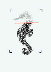
Sketch 1 of “QR ‘Hippocampus’” (source: made by the authors).

Sketch 2 of “QR ‘Hippocampus’” (source: made by the authors).
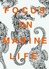
Completed picture of the poster “QR ‘Hippocampus’” (source: made by the authors).
4.4.3. Design Process and Description of “Breakout”
The last is the public welfare poster design about the food crisis. This poster is to remind people to cherish food by expressing human desire for it. By breaking the hemp rope, the wheat and the hand eager for food are heterogeneous isomorphic with the broken part of the rope. The thinnest part of the hemp rope is about to break, creating a tense atmosphere, and the broken part is the hands of human beings who cannot touch the food, which stimulates people's inner fear of losing food and makes them think and even act to cherish food more. In the first draft stage (Fig. 10), the expressiveness of the combination between the rope and the hand is weak, so in the refinement stage, the hand is shown as a thin and dry shape, and the hunger is more prominent (Fig. 11). The text part of the poster, as the only connecting part of the break, enriches the sense of form and highlights the theme.
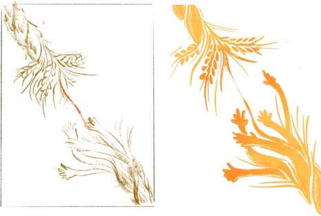
Sketches of “Breakout” (source: made by the authors).
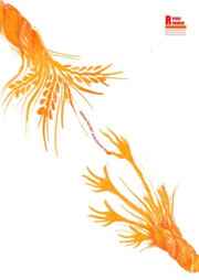
Completed picture of the poster “Breakout” (source: made by the authors).
5. CONCLUSION
Through the above design practice of public welfare posters for three different themes, on the basis of meeting the needs of public welfare poster design with clear theme appeal, creative viewpoints in line with morality and ethics, and appropriate exaggerated metaphors, the design works are performed in the form of surrealism of heterogeneous isomorphism, and in accordance with the three main points of embodying simplicity, highlighting interest, and enhancing emotion respectively. To a certain extent, the design practice works have verified that the appearance of heterogeneous isomorphism can improve the visual effect of public welfare posters, enrich the expressiveness of public welfare poster design, and thus enhance the effect of disseminating information. In the design process, the method of petal mind map is used to provide ideas for the preparatory work of poster design. There is still a lot of room for thinking in this design practice work. As a designer, in the future, it is necessary to pay more attention to creating purposeful creation in accordance with the theme, and pay attention to observe and think about the meaning and expression of various graphic ideas in life. It is also necessary for the designers to apply it to design works to add strength to the creation of public welfare posters.
REFERENCES
Cite This Article

TY  - CONF
AU  - Yanjun Wang
AU  - Jingning Shi
PY  - 2022
DA  - 2022/11/21
TI  - Study on the Application of Heterogeneous Isomorphic Graphics in the Design of Public Welfare Posters
BT  - Proceedings of the 8th International Conference on Arts, Design and Contemporary Education (ICADCE 2022)
PB  - Athena Publishing
SP  - 307
EP  - 314
SN  - 2949-8937
UR  - https://doi.org/10.55060/s.atssh.221107.047
DO  - https://doi.org/10.55060/s.atssh.221107.047
ID  - Wang2022
ER  -


